Usability Analysis
Bank of the State of Chile
[UX/UI Projects]I analyzed the main screens of the Banco Estado app, seeking improvements in its flow and interface. My analysis was based on Nielsen's Heuristics criteria and general usability principles. Below, I present the identified problems and their potential solutions.
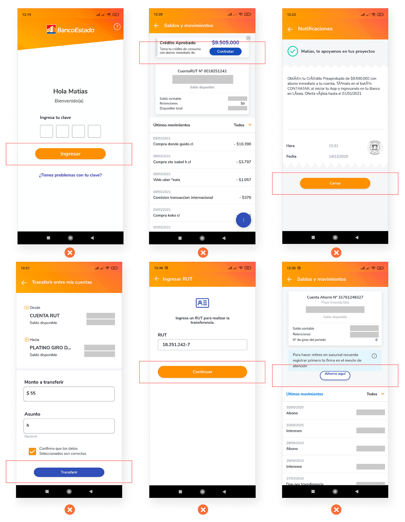
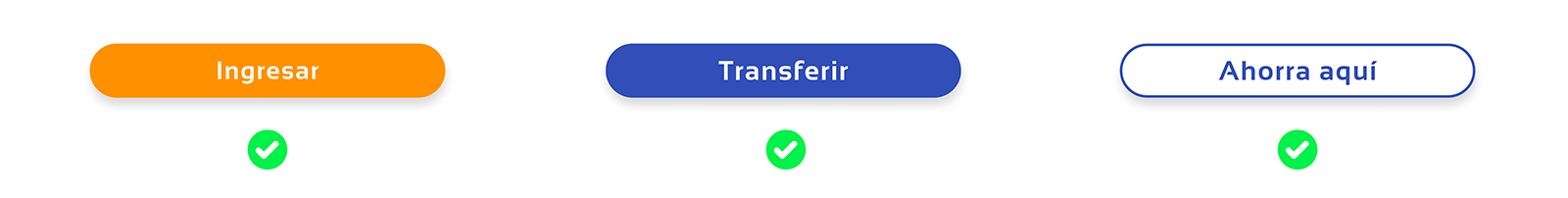
Inconsistency in Call to Action
It can be seen in the different screens that there is a lack of standardization of the Call to action, differing in width, height, borders and fonts. This could make the user suspicious of buttons that may look like external advertising offers, such as the “Sign up” or “Save here” Call to action, in addition to the fact that the latter does not have vertically aligned typography.
Solution
Standardize the design of Call to Action buttons throughout the app, ensuring consistency in size, color, font, and alignment. This will enhance user trust and improve the overall user experience.
-------------------------------
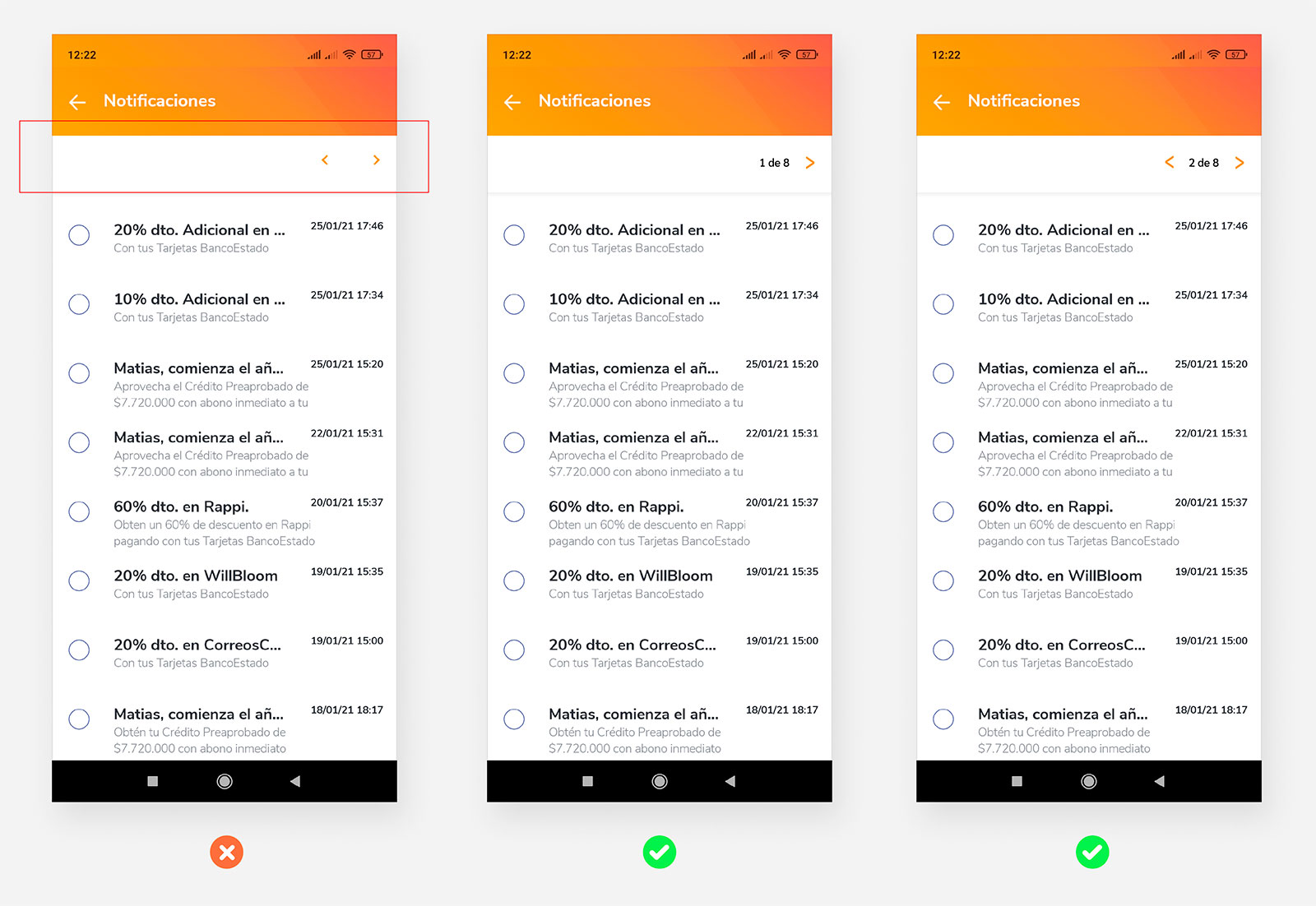
Lack of pagination
In the Notifications section, there is no pagination or indication of the user's location, it is not possible to know the number of pages with notifications that are available.
Solution
Create pagination so that the user can locate himself within the Notifications. The left arrow is removed on page 1 as it is of no use.
-------------------------------
Missing option to clear notifications
There is no alternative to clean the different notifications that the user receives, so they accumulate over time and the only way to empty them would be to review them one by one, which is a waste of time for the user.
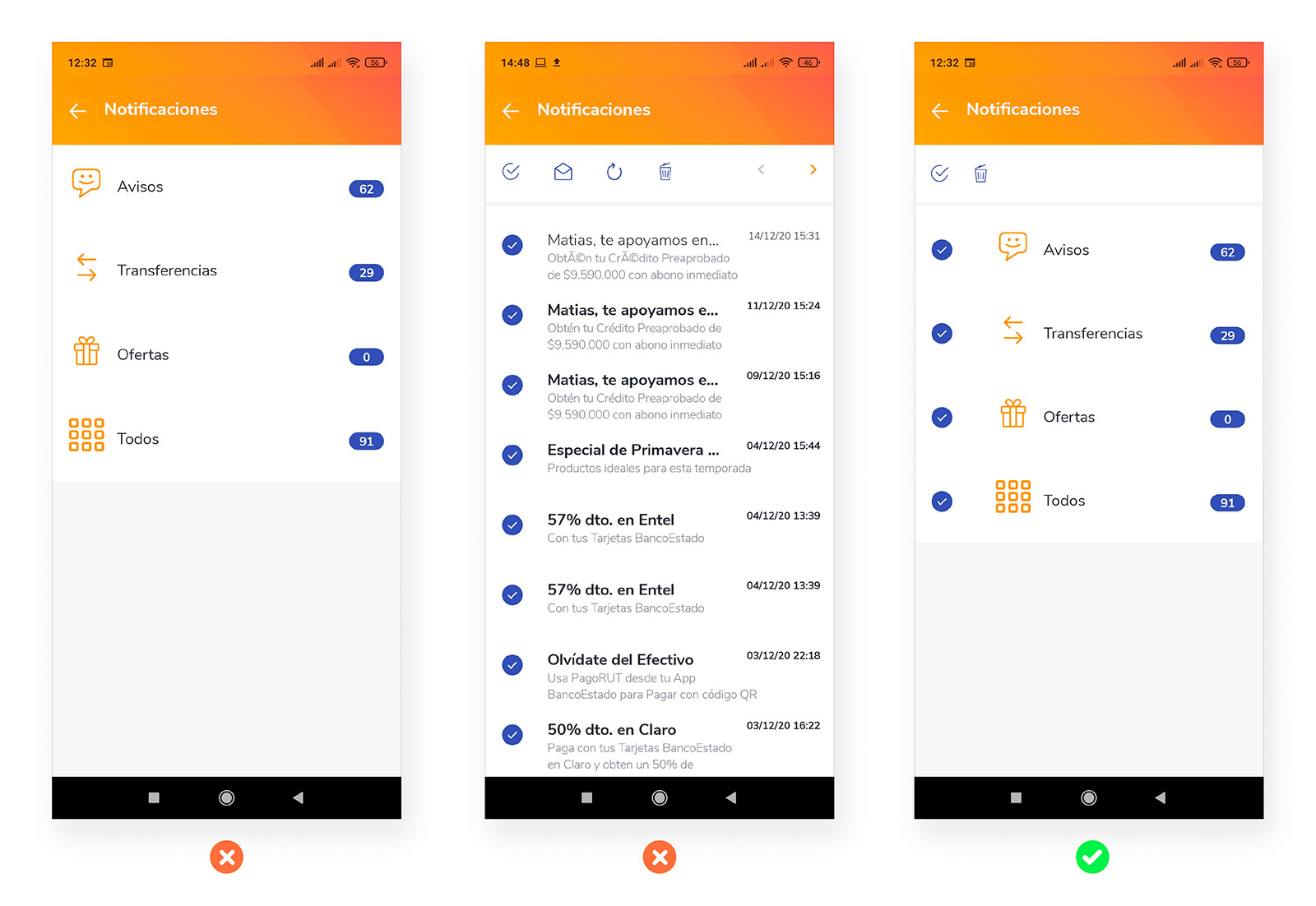
Solution
Implement the Select and Delete buttons to be able to empty all the notifications accumulated in all the categories.
-------------------------------
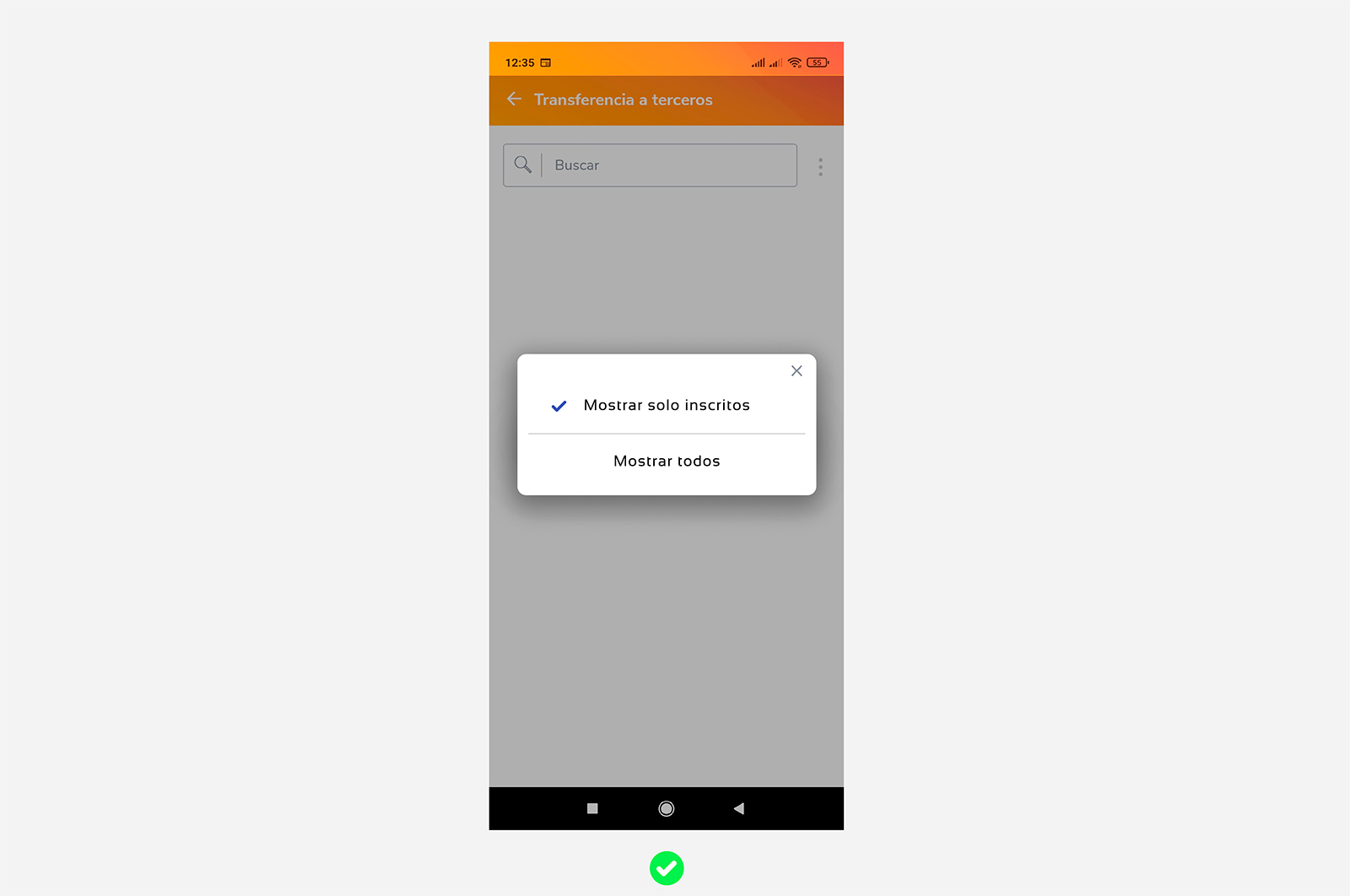
Contact filter optimization
When wanting to filter the contacts in "Transfer to third parties" only the filter that can be changed appears, the current filter type does not appear. Both options should appear.
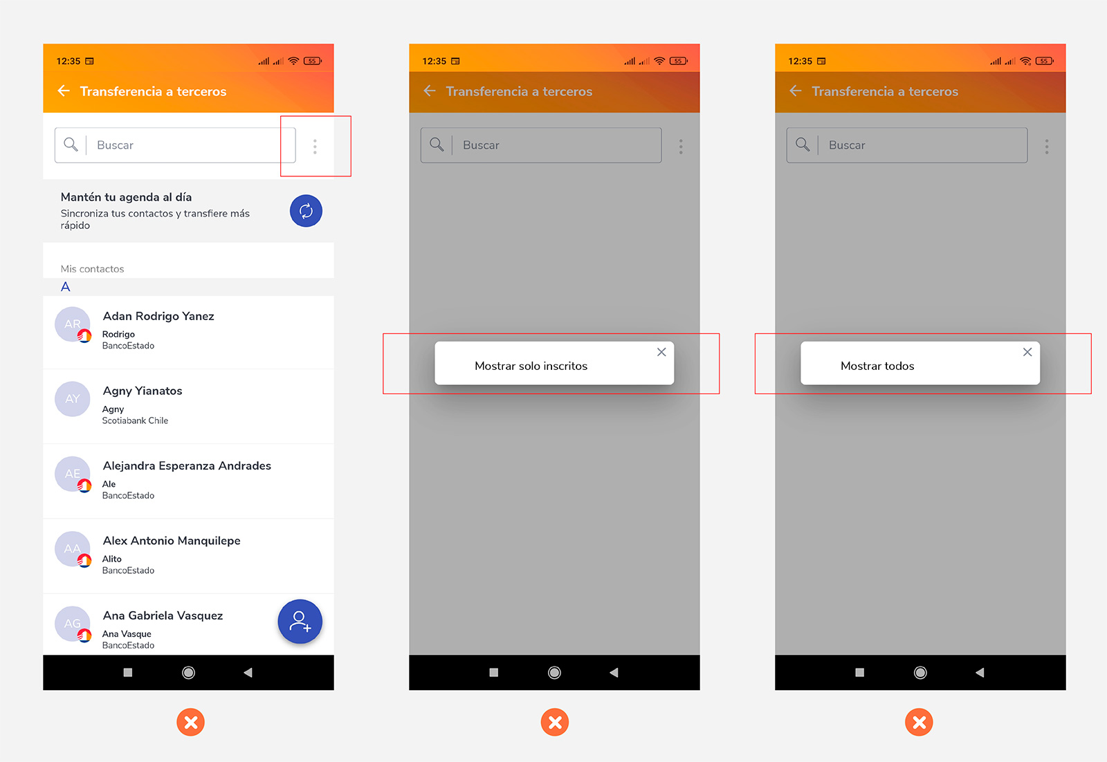
Solution
Make the pop-up have both filters visible.