Heuristic Evaluation
Expedia.com
[UX/UI Projects]Performed a deep-dive heuristic analysis of Expedia.com to diagnose functional and navigational inefficiencies. By applying Nielsen’s Usability Principles, I documented key pain points affecting the user journey across desktop and mobile interfaces.
1. System visibility
UX ISSUE
The location of the user within the site is not reported.
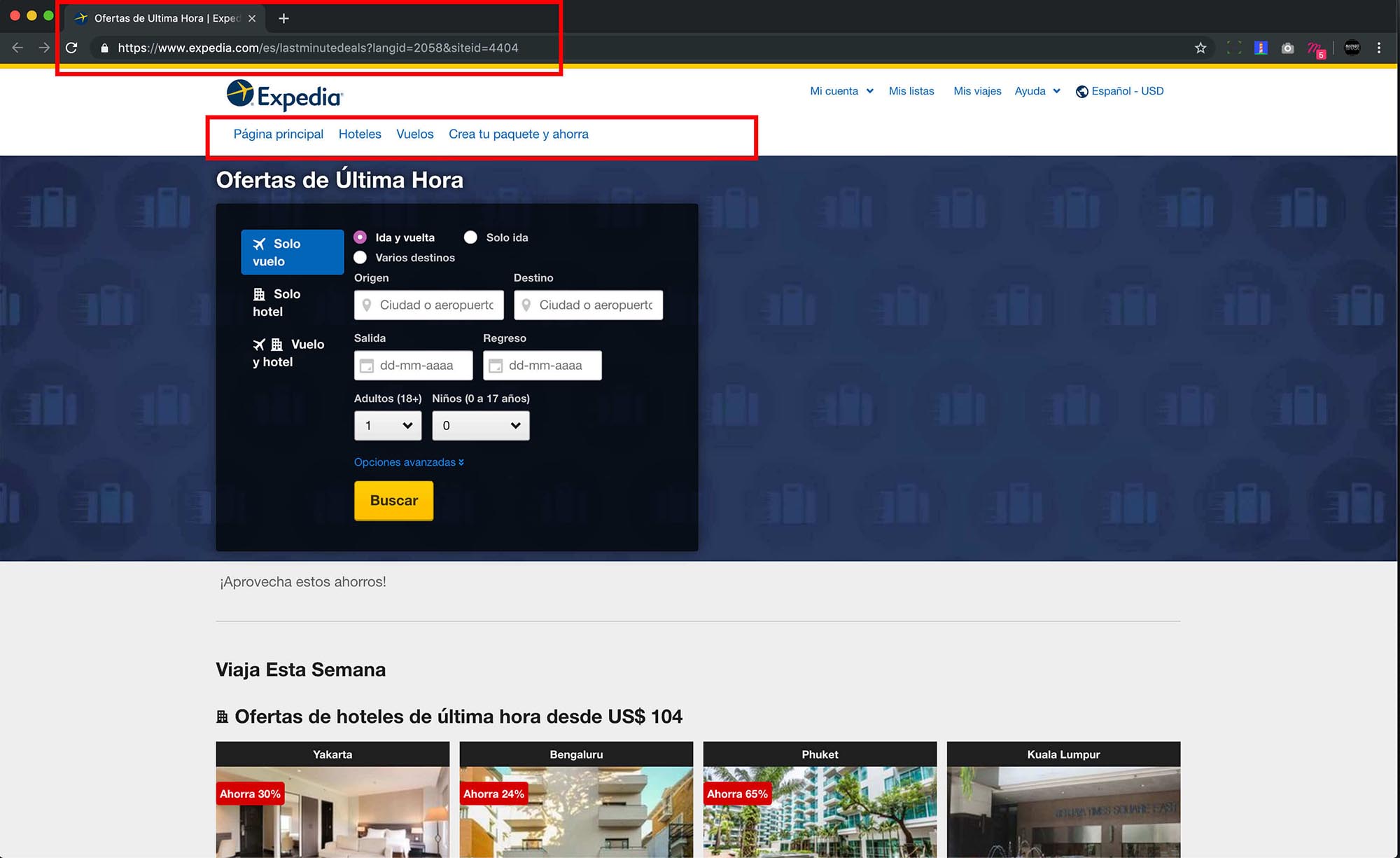
SOLUTION
Use Breadcrumbs, whose function is to show the route, pages or steps that a user has taken, which allows you to guide navigation within the website.
UX ISSUE
Loading screen does not inform about search status.
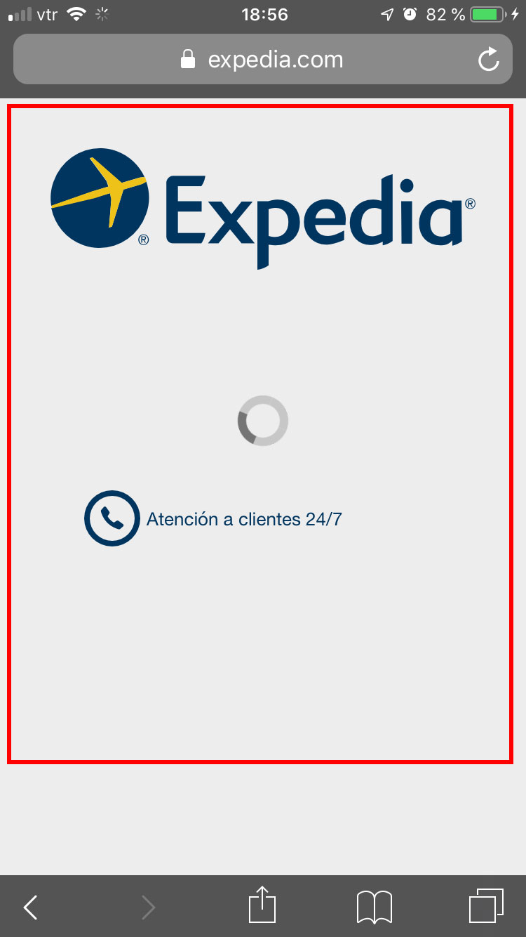
SOLUTION
The text should be "Loading your search" or a phrase consistent with the action the user took.
-------------------------------
2. Match between system and real world.
UX ISSUE
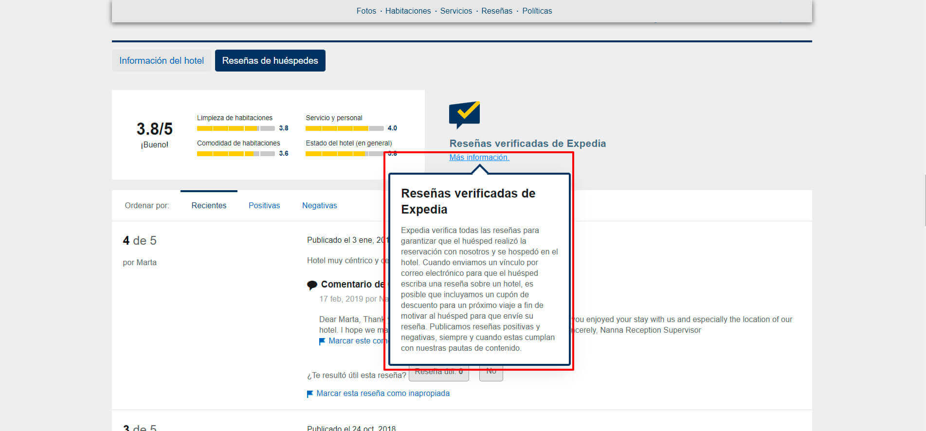
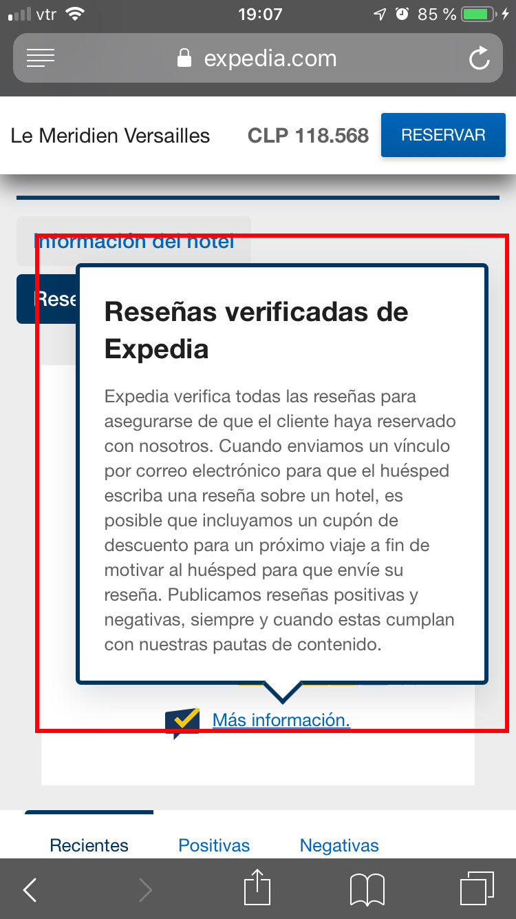
Non-compliance with selected language.
SOLUTION
If a user selects the Spanish language on the website, it should be the only language on the entire site, on every page and in every article. Therefore, the words that do not match the chosen language must be translated.
UX ISSUE
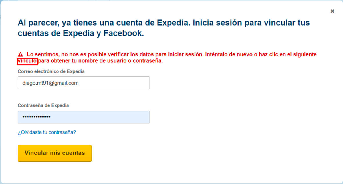
Icons and images that do not represent the corresponding meaning.
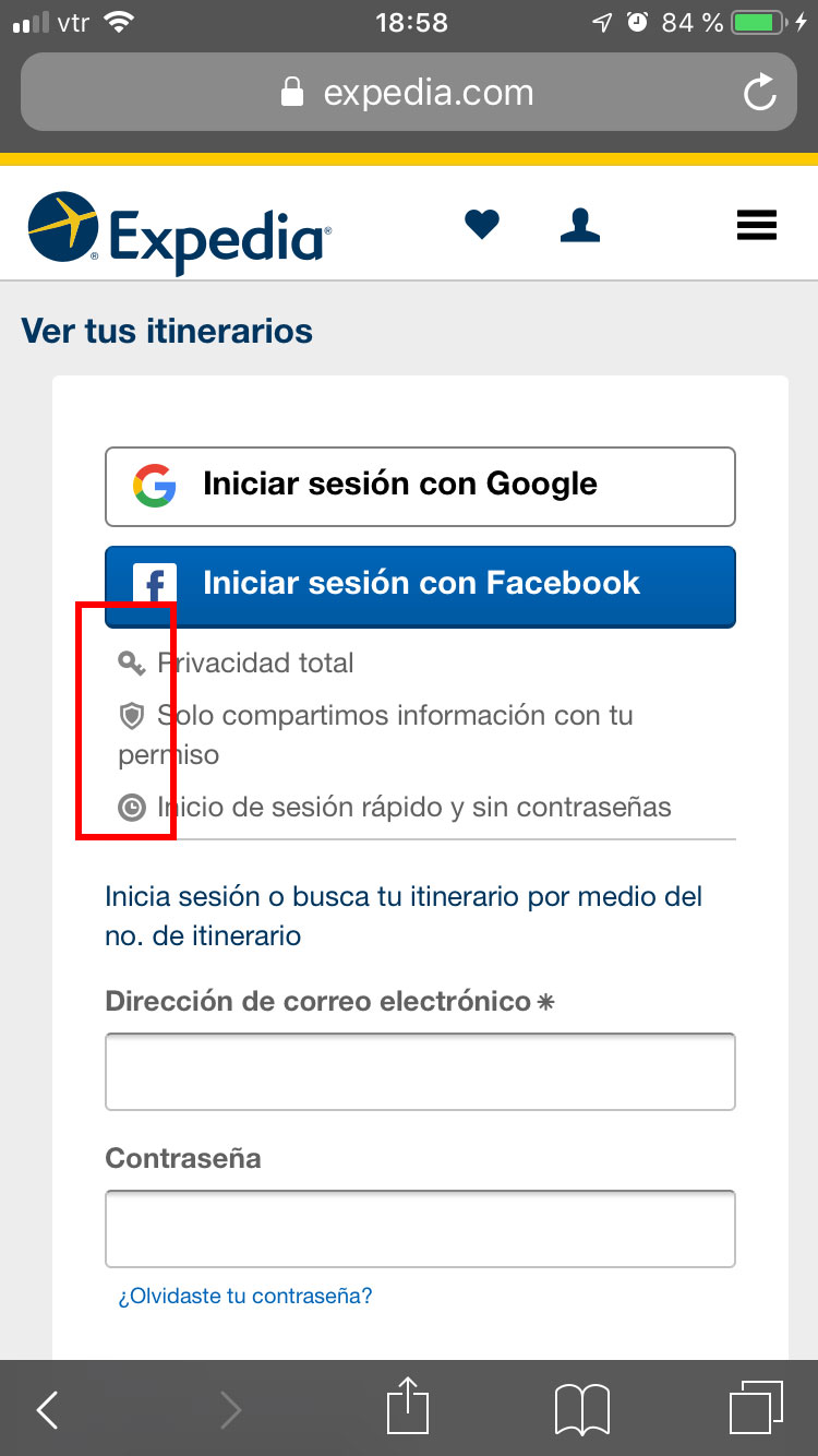
SOLUTION
Use icons that support the idea that you want to express, for example when it says "Total privacy" by convention on different platforms and systems, a padlock is usually used as an icon, also the icon for "Quick login and without passwords" is used a clock, when a user profile icon should be used.
-------------------------------
3. User control and freedom.
UX ISSUE
There is no option to close or hide additional message.
SOLUTION
Place an X inside the modal windows that commonly represents close or directly put the word close.
UX ISSUE
There is no option to close or hide additional message.
SOLUTION
Same solution as on desktop.
-------------------------------
4. Consistency and standards.
UX ISSUE
Inconsistency in design and format.
SOLUTION
The design and structure of the website should be the same in different pages, sections and articles of the website, this includes buttons, font size and family, colors, spaces, titles, etc. Therefore, the same visual line must be maintained in all the contexts of the website.
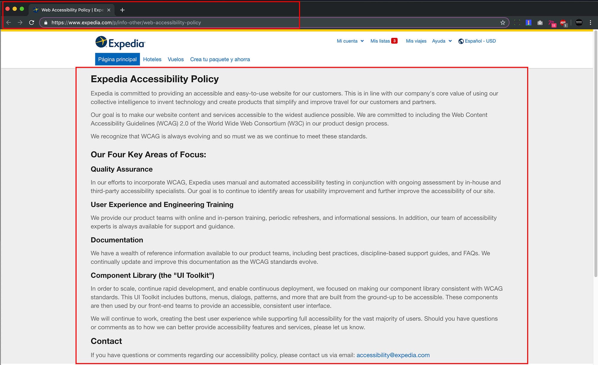
UX ISSUE
Inconsistency in the name of the "Accessibility" link.
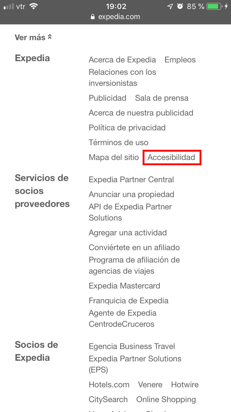
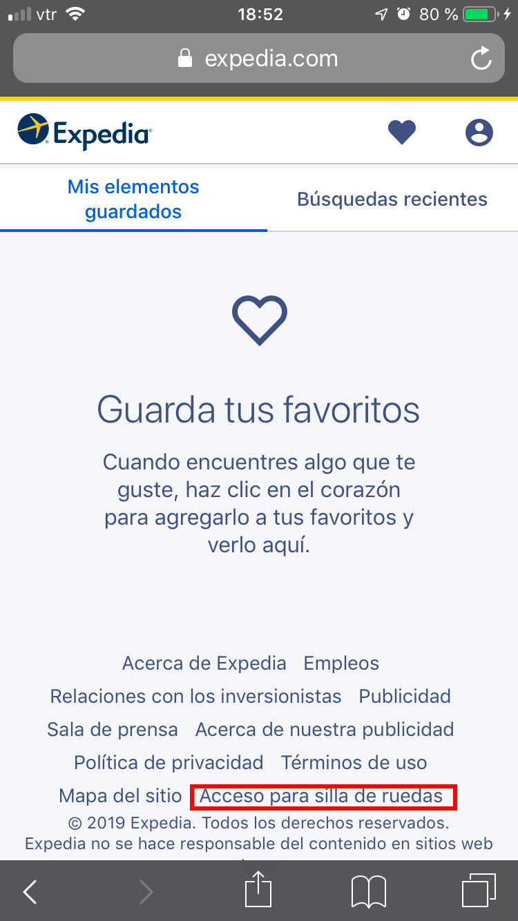
SOLUTION
Decide on a concept to be used within all the pages of the website.
-------------------------------
5. Error prevention.
UX ISSUE
It does not previously inform the user that reservations cannot exceed a maximum of days.
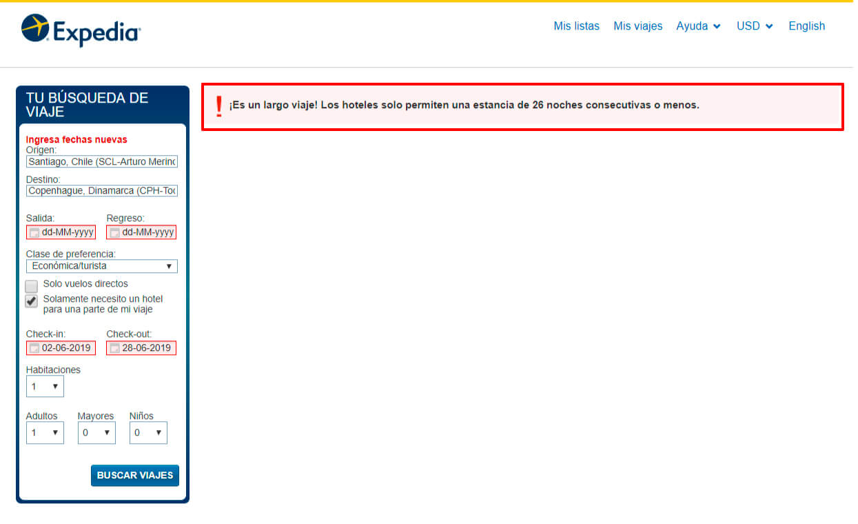
SOLUTION
If the user selects a larger date range than is allowed, they should be notified before the search starts which leads to an error page where the user is not given a solution, wasting their time.
UX ISSUE
Page "My Points" redirects to the start of the site.
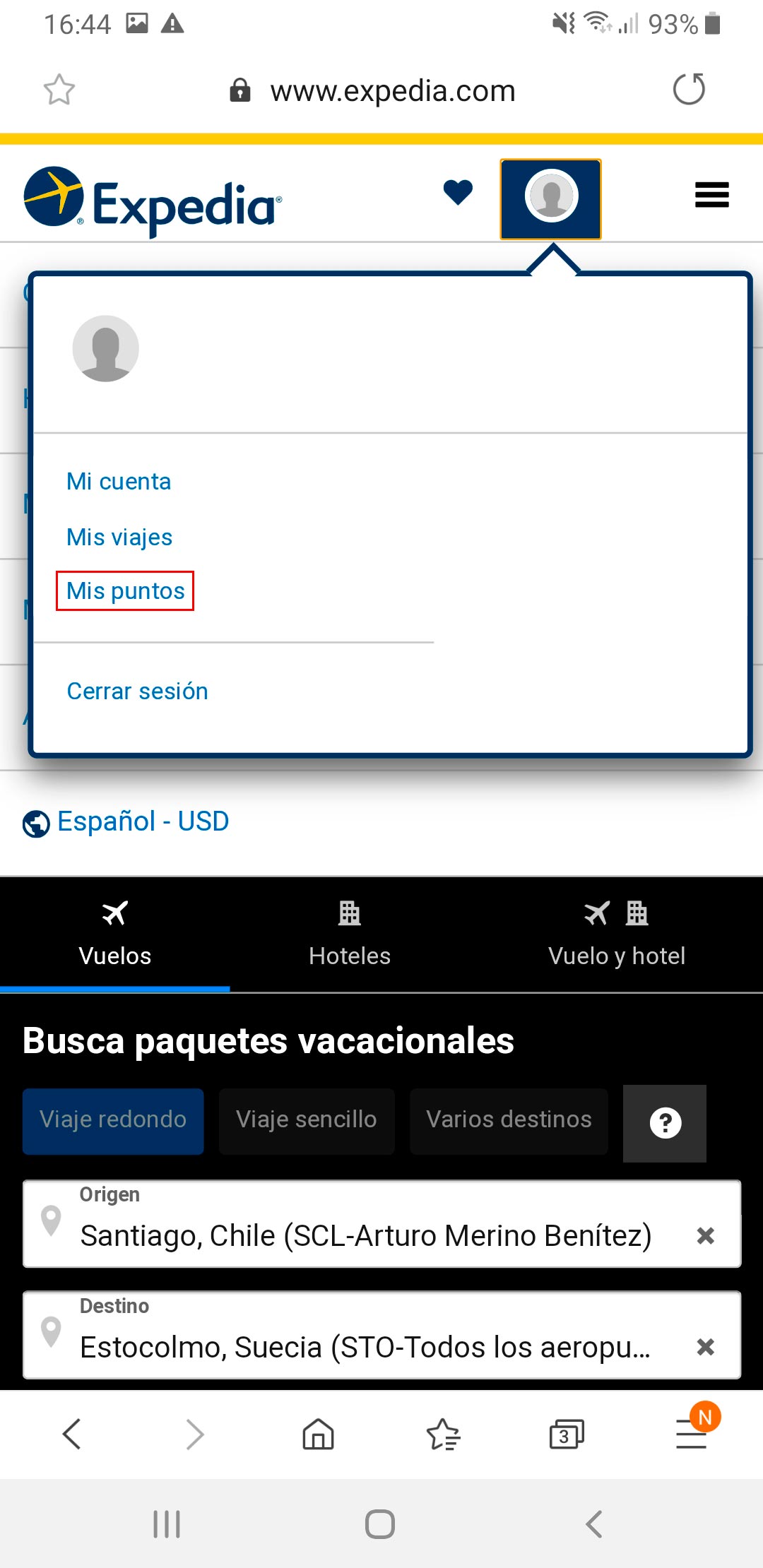
SOLUTION
If there is no content for the "My points" page, it is better to remove that link, or if the content is about to be uploaded to the site, a page could be created that communicates: "Sorry, we are working on the content for this section, it will be active soon".
-------------------------------
6. Minimize cognitive load.
UX ISSUE
Option is not easy to find, it is not very visible.
SOLUTION
The version change of a website is usually in the upper right corner, if you want to reduce the user's cognitive load and make navigation easier, it would be correct to stay within web conventions.
UX ISSUE
Request for personal information even when the session is already started.
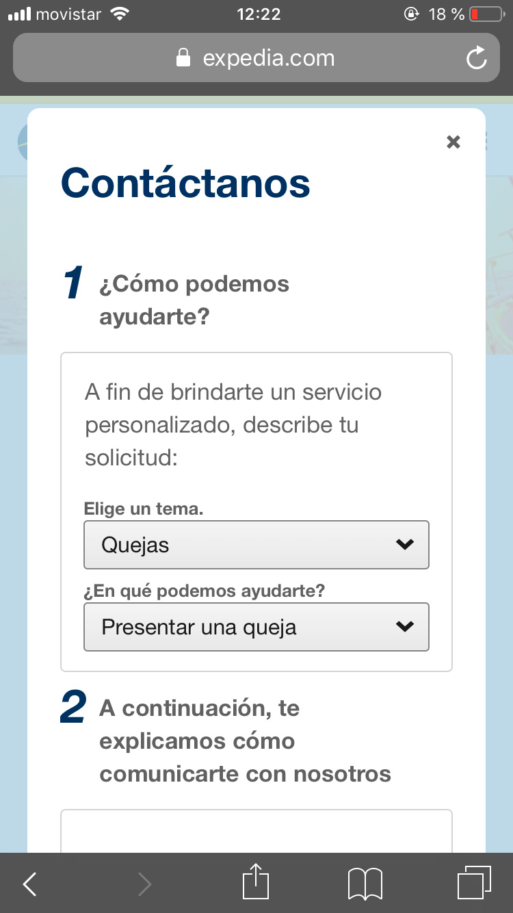
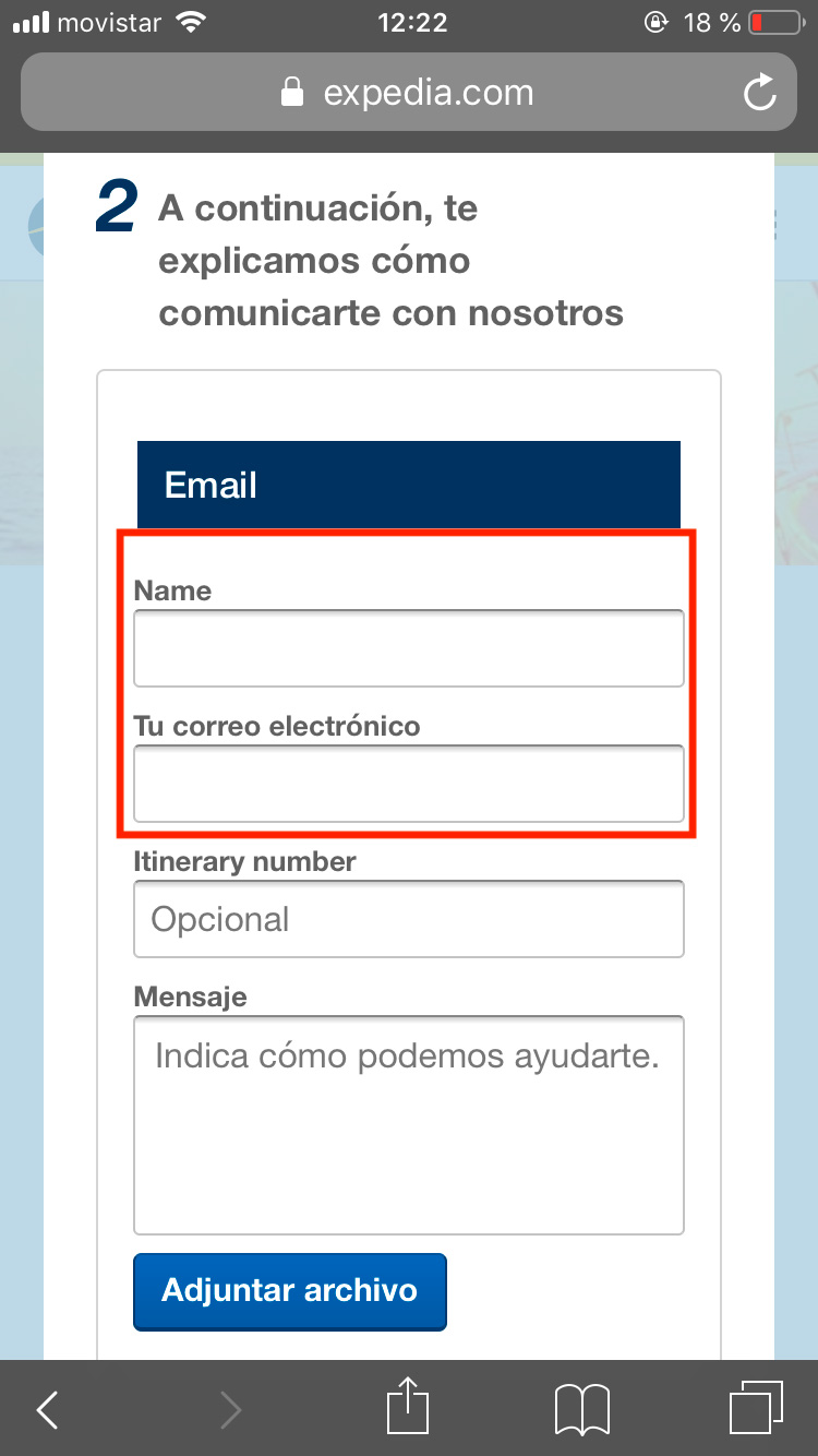
SOLUTION
If the user is already logged in, when making a comment or leaving a review, the system should not ask for the login again (unless a certain time of inactivity has been met), as this hinders the fluidity in which the user perform actions within the website.
-------------------------------
7. Flexibility and efficiency of uses.
UX ISSUE
Airline selector too long.
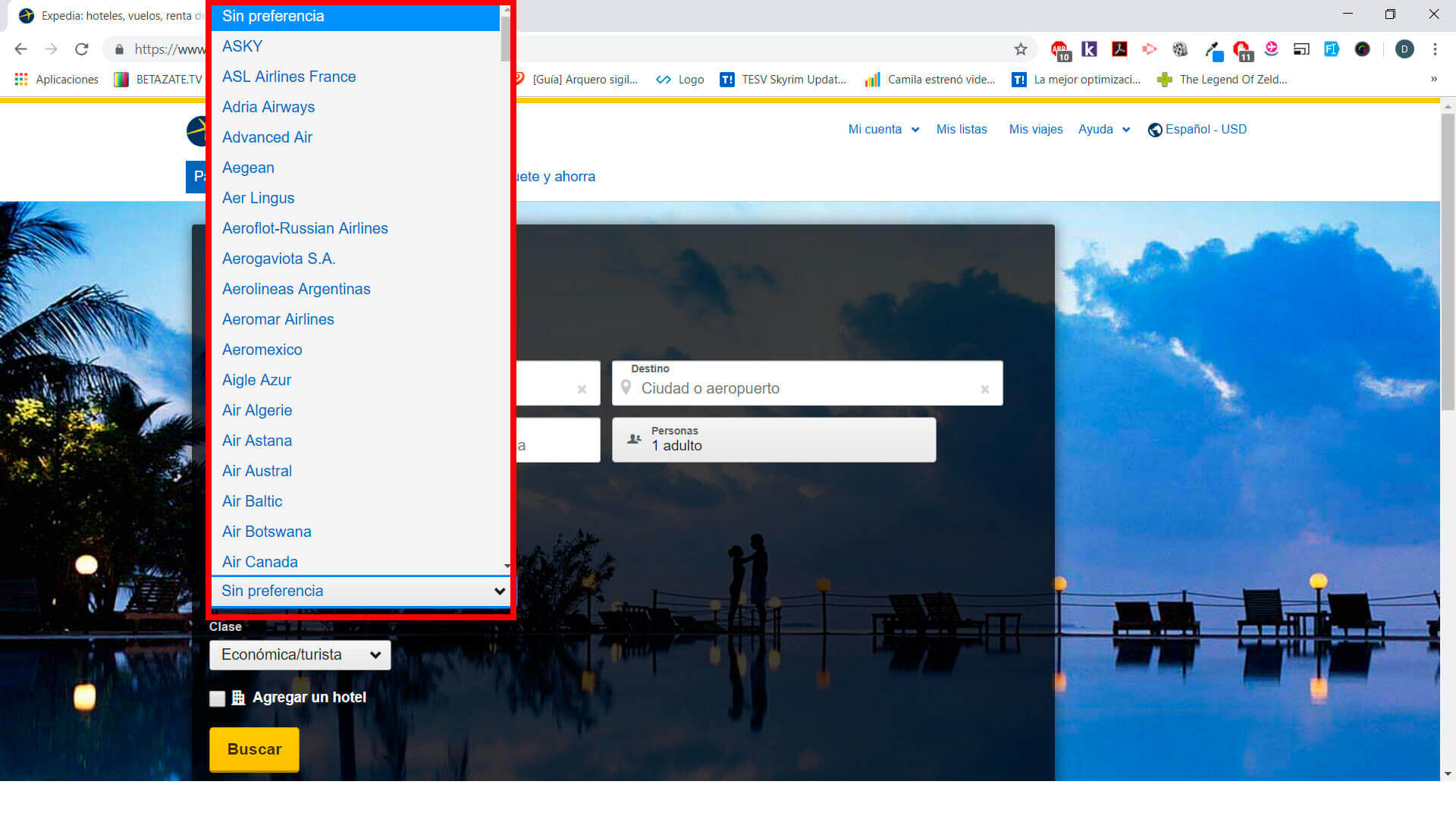
SOLUTION
A better way to display the airlines would be to first categorize or filter by country, so the list would be much shorter.
-------------------------------
8. Aesthetic and Minimalist Design.
UX ISSUE
Information overload on the screen.
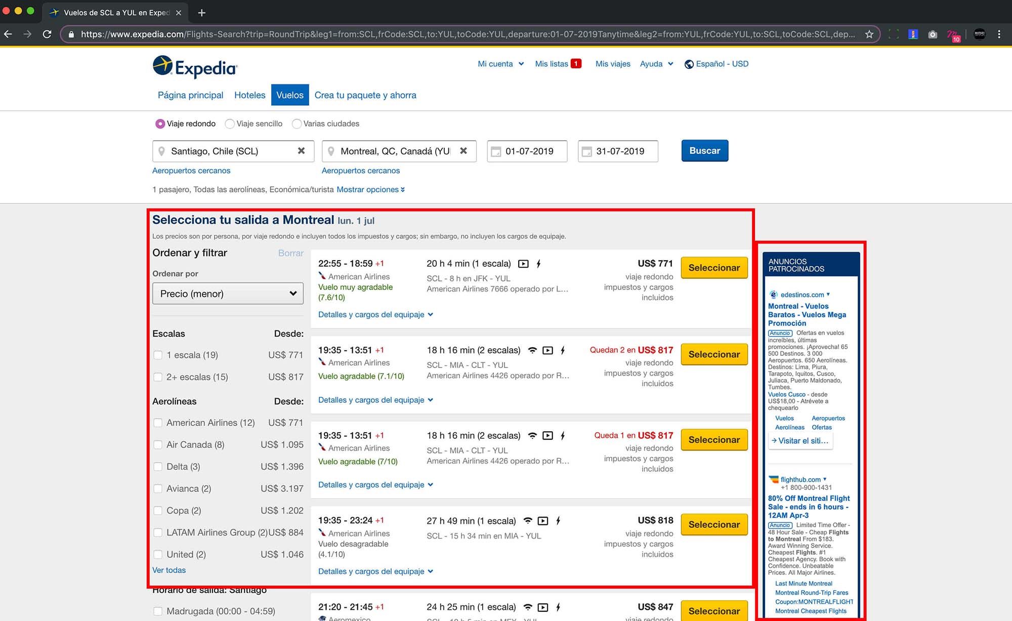
SOLUTION
Expedia should use a smaller amount and/or size of advertising graphics on the main pages of the site, or at least.
UX ISSUE
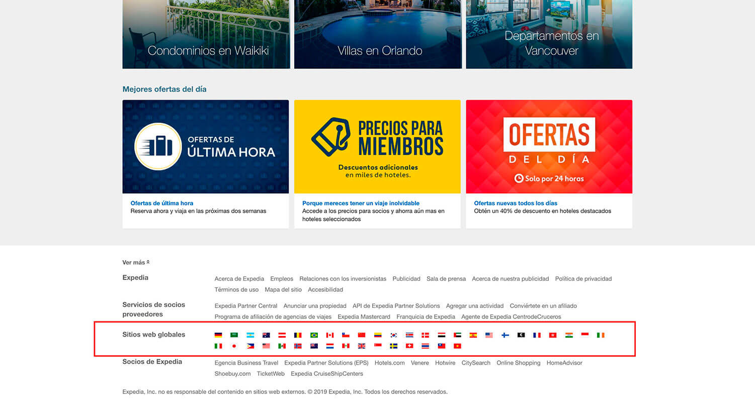
It is difficult to select the country.
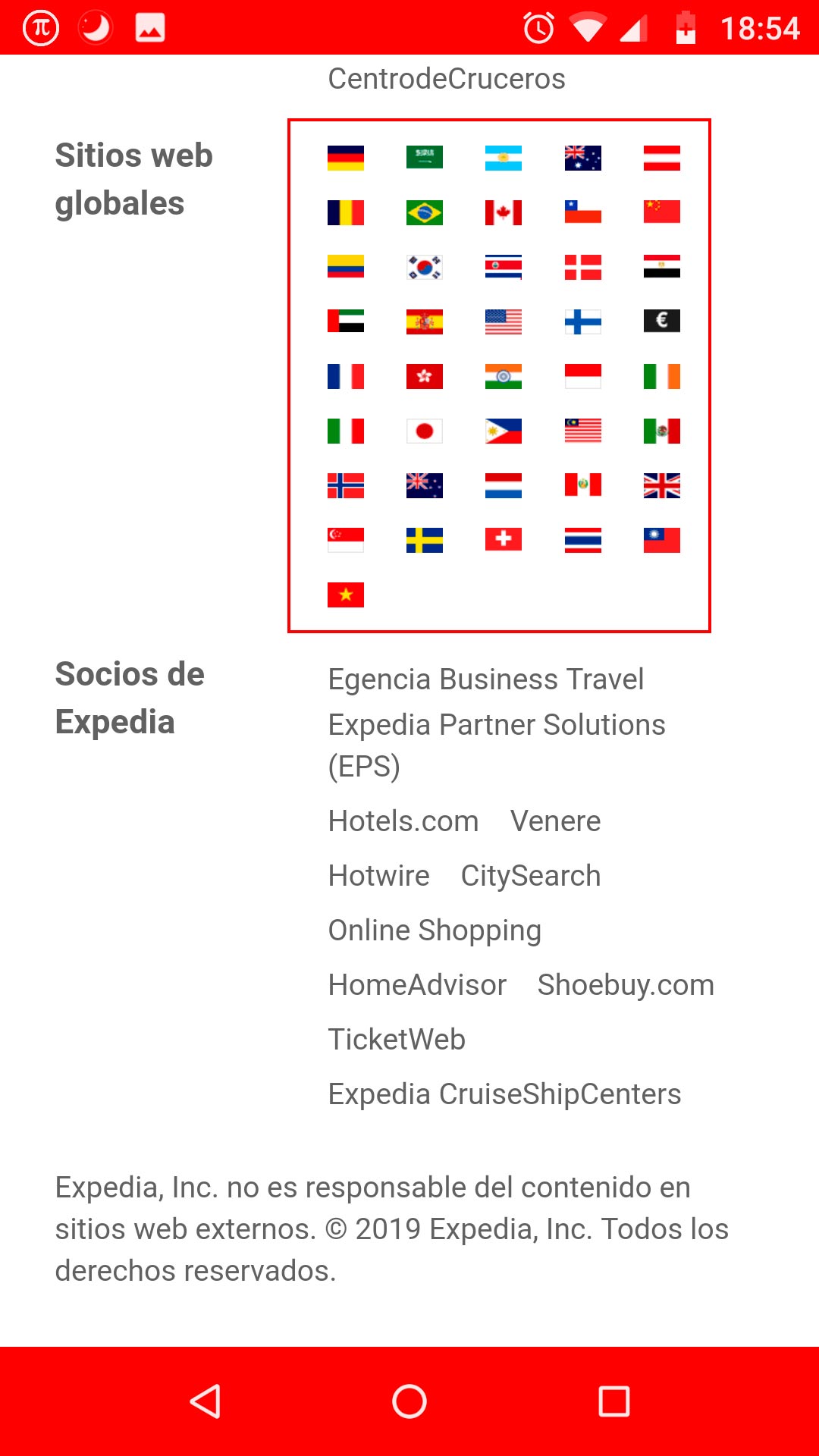
SOLUTION
The option to change the country should be in the header of the site, showing the currently selected country and when the user needs to interact with this option, a selector with all the flags and their names is displayed as an option. In addition to giving more space between elements and make them bigger.
-------------------------------
9. Help users recognize, diagnose, and recover from errors.
UX ISSUE
Help link with no associated link.
SOLUTION
Enter a URL to the empty link, otherwise it is better to delete the link, it is a bad practice to have empty or broken links, since it indicates that the site is not in constant maintenance or updating.
-------------------------------
10. Help and documentation.
UX ISSUE
Contact number not visible.
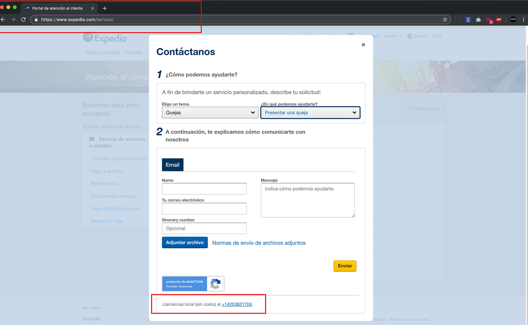
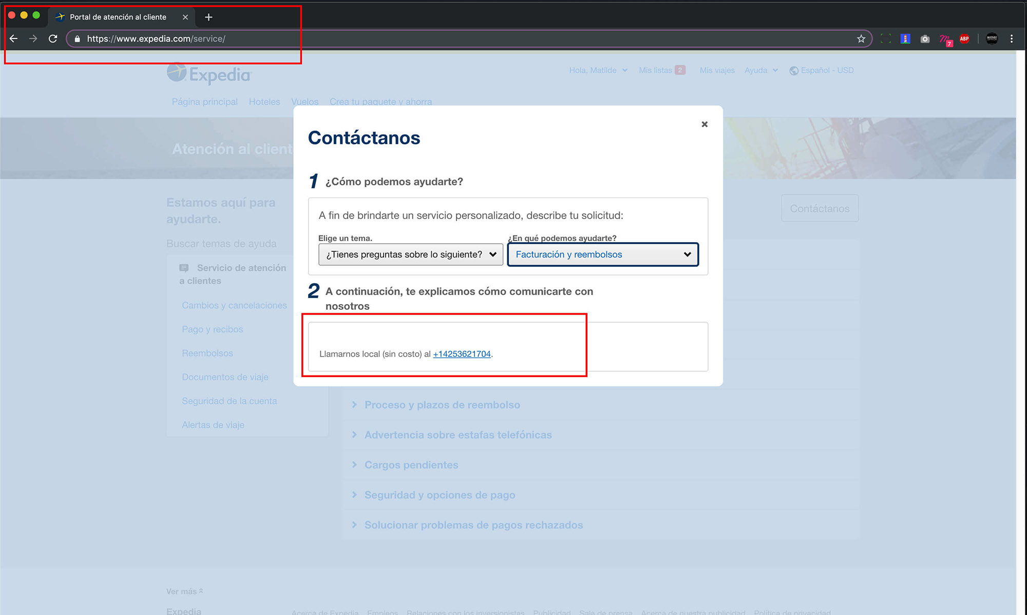
SOLUTION
The contact number to ask questions or queries is located in a place that is difficult to locate and access.
UX ISSUE
There is no site map.
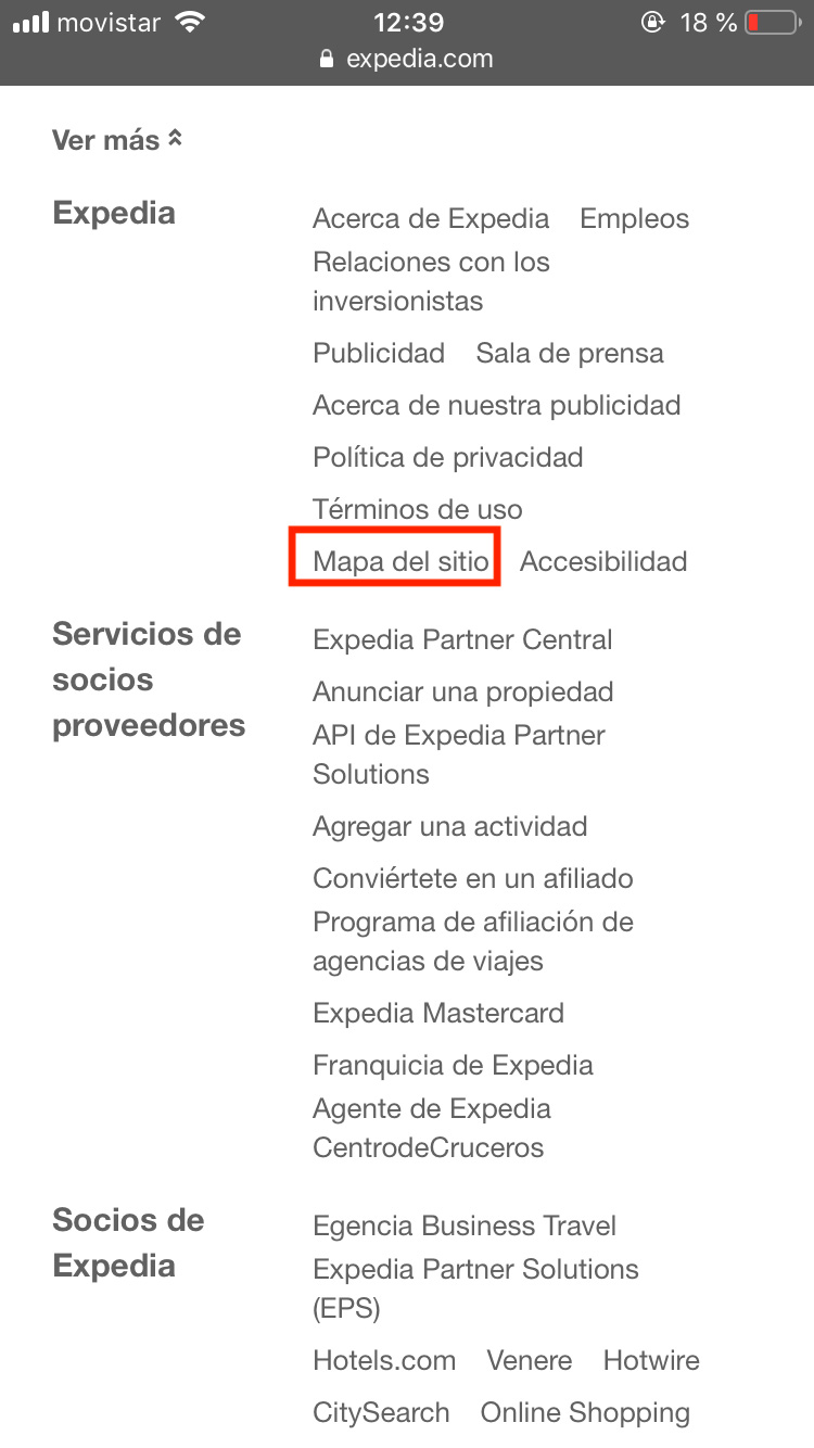
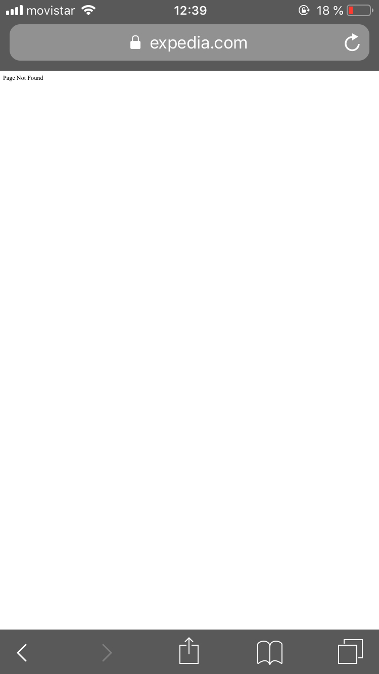
SOLUTION
It is necessary to place the sitemap in the footer or in the last case leave it in a link, but it must be available on the site, since they generally contain information relevant to the user and the use of the website.