Branding & Packaging
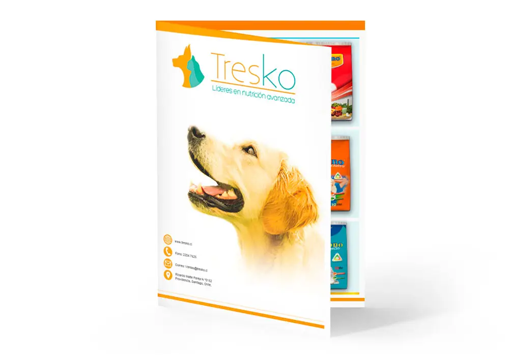
Tresko Company
[Graphic Projects]Brand development for Tresko Company, organized from digital-first concept work to identity deployment and packaging applications. The sequence highlights UI/digital relevance first, then branding assets, and finally packaging execution.
1. Logos
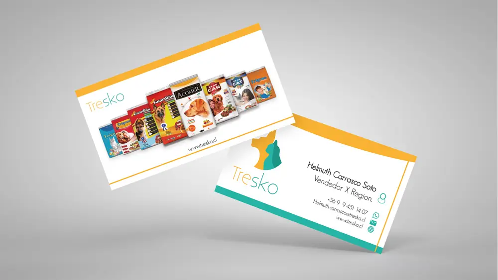
Logo explorations for Tresko focused on building a recognizable, flexible, and competitive brand for the Chilean market. Each variant prioritizes legibility, memorability, and adaptation across digital and physical touchpoints.
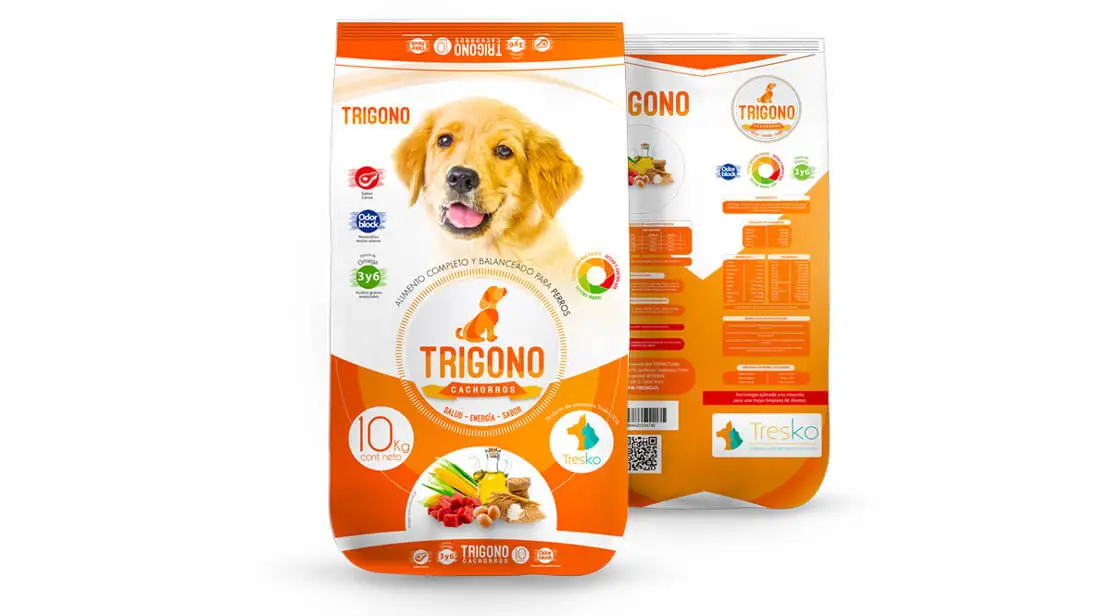
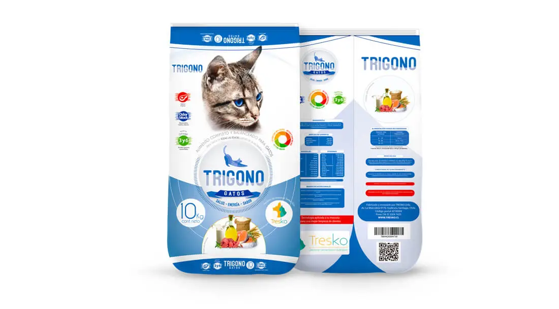
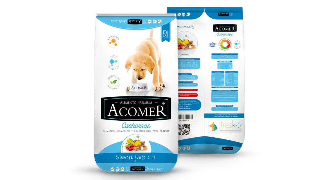
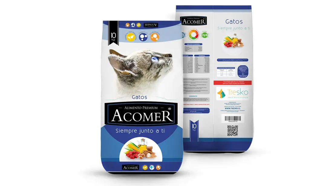
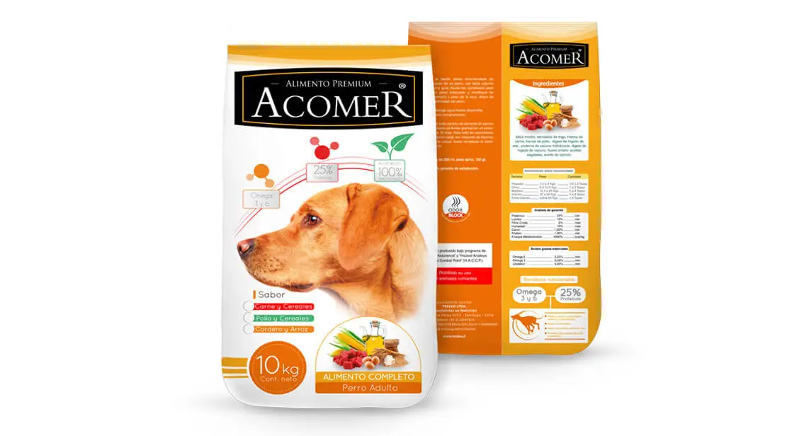
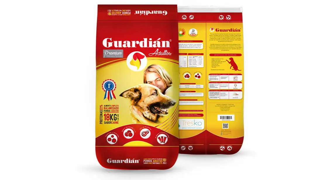
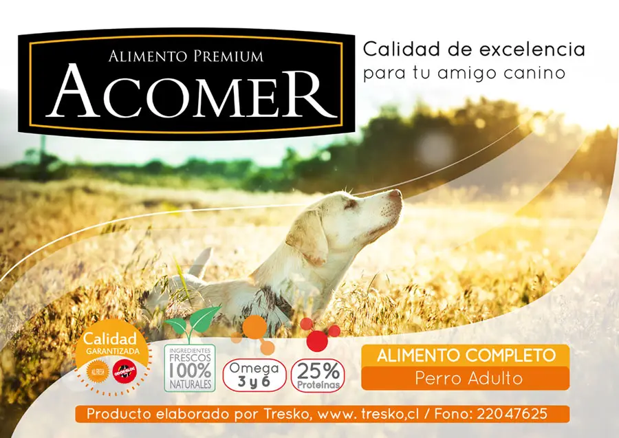
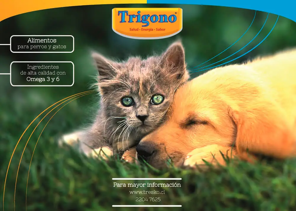
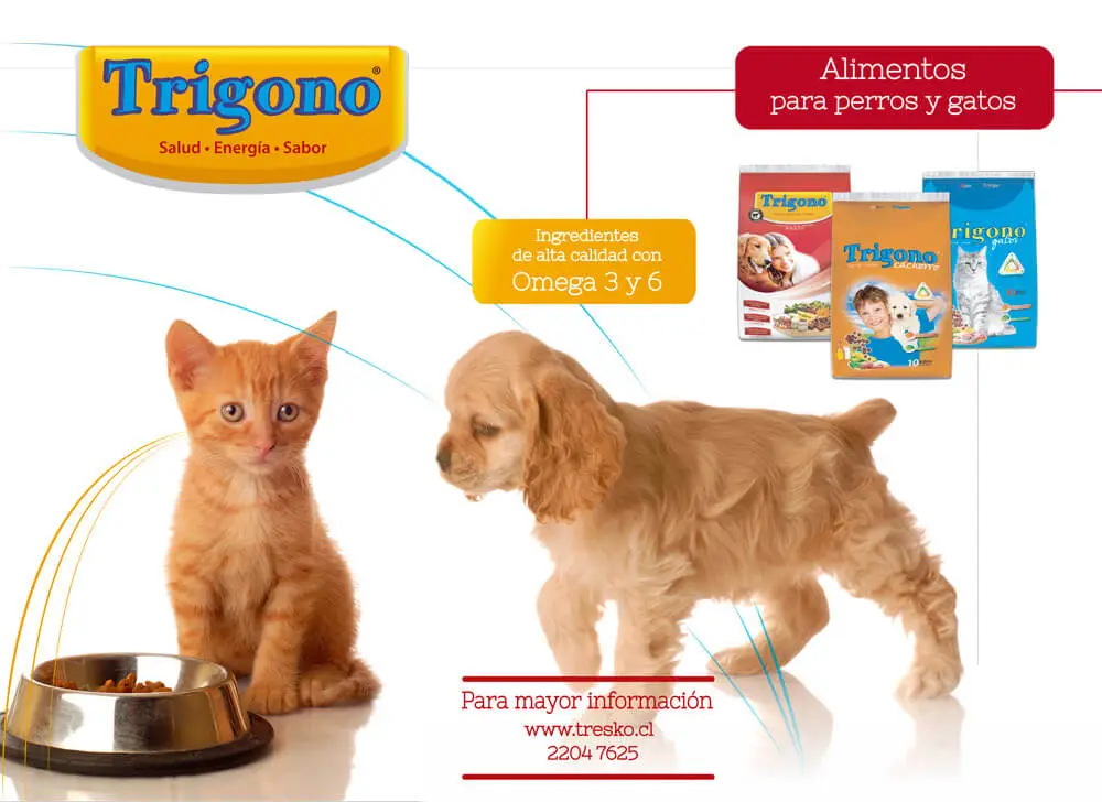
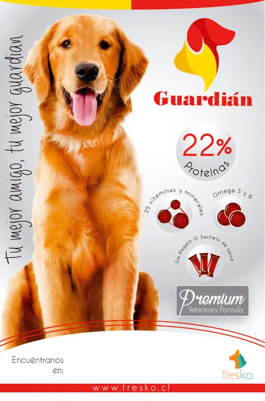
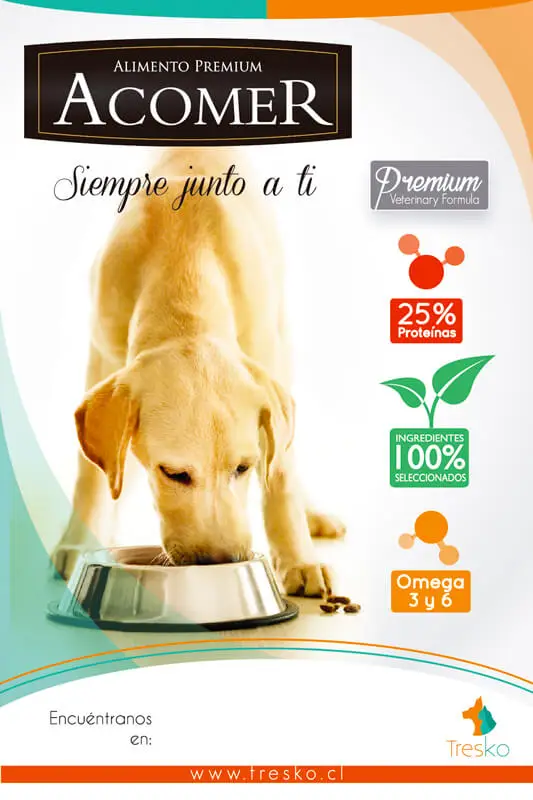
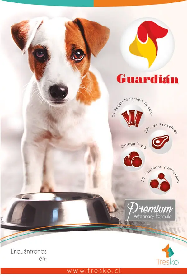
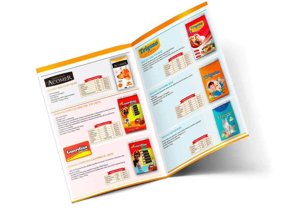
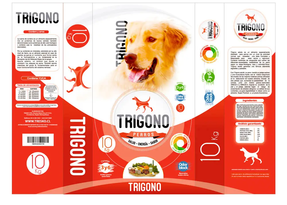
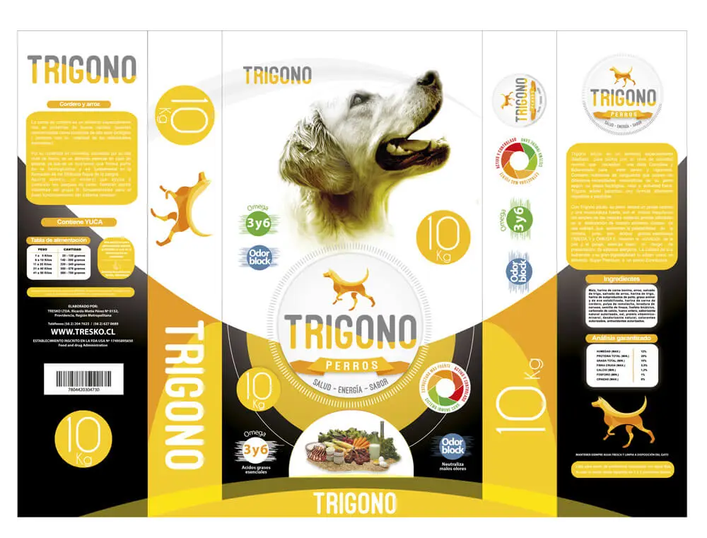
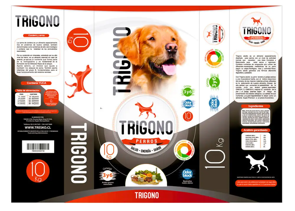
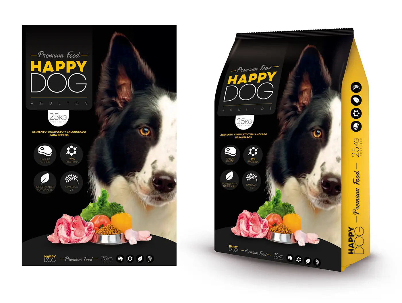
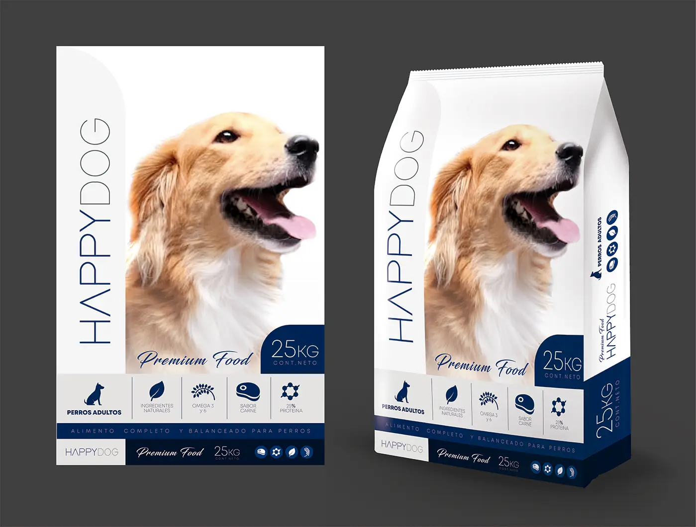
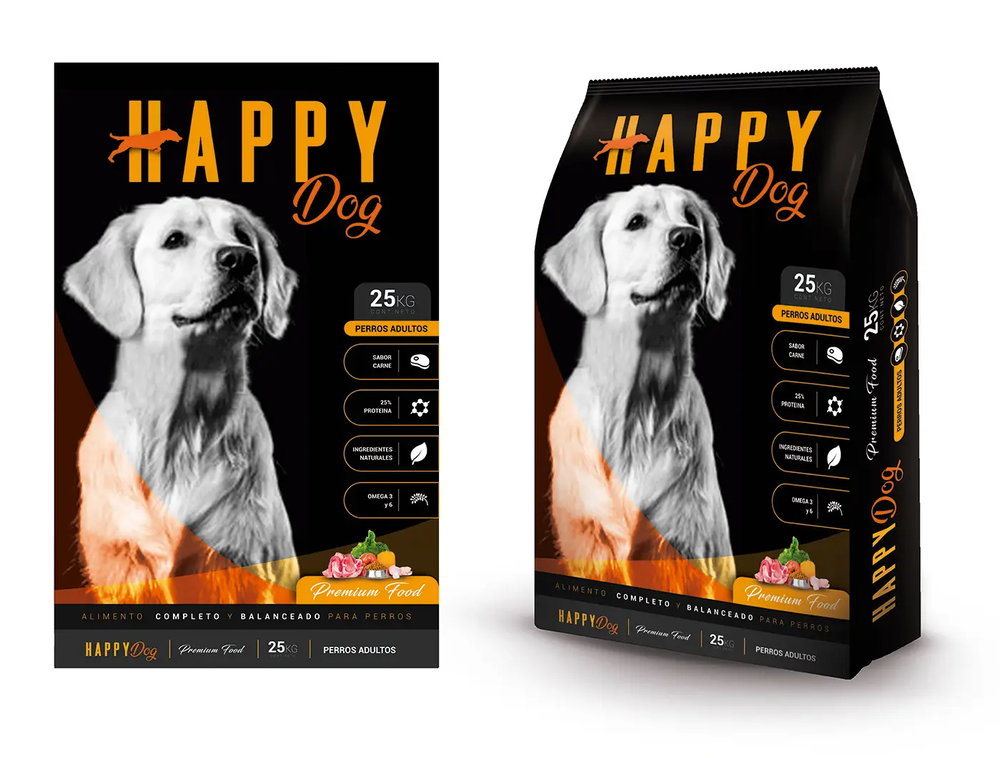
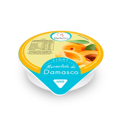
2. Packaging
Packaging development focused on shelf impact and immediate brand communication in Chile. The visual system for Trigono Cat, Trigono Dog, and Acomer remains in use with the same core design due sustained commercial performance and brand recognition at point of sale.
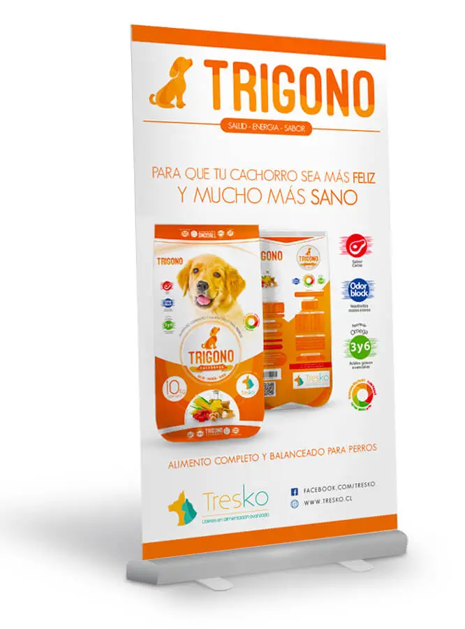
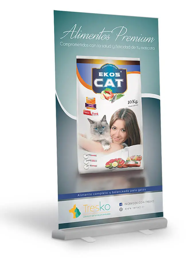
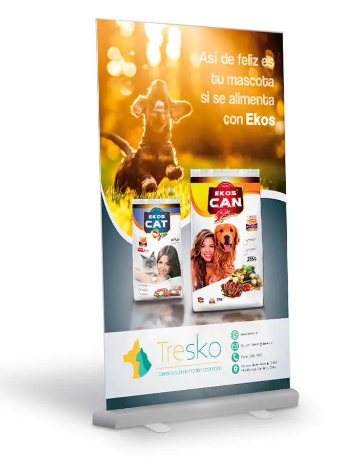
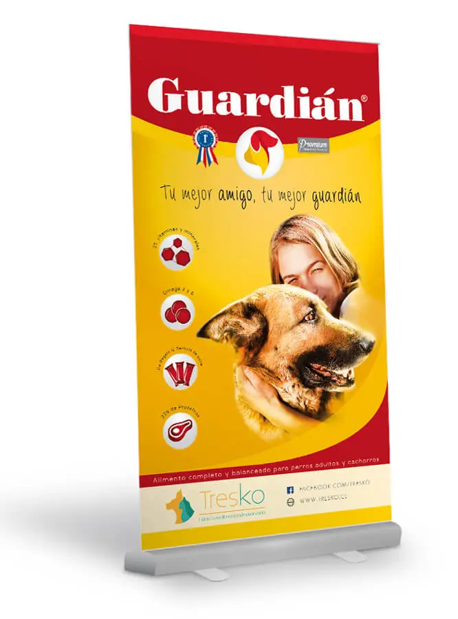
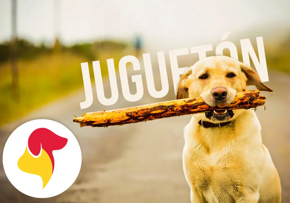
3. Roll-up Banners
Roll-up banner system for activations and retail points, designed to communicate key messages in seconds. The visual approach reinforces Tresko’s identity and improves visibility in Chilean commercial environments.
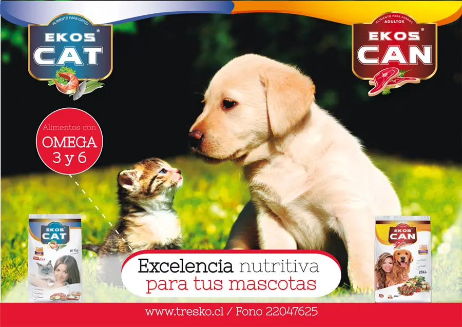
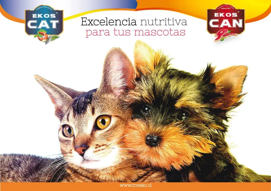
4. Posters
Poster pieces developed for high visual-impact campaigns. Composition, typographic hierarchy, and color are designed to capture attention quickly and consolidate Tresko’s value proposition for Chilean audiences.
5. Editorial
Editorial applications that extend the brand’s visual language across reading and presentation formats. These pieces strengthen coherence, tone, and the perception of professionalism in communications for the Chilean context.
6. Proposals
Initial visual proposal line used to explore positioning, tone, and creative direction. This block highlights the strategic value of design by aligning identity, business goals, and growth opportunities in Chile.
More Graphic Projects
Branding & Packaging
[Relkon Company]
Ads & Editorial Design
[Merrell]
Motion Graphics
[Multi-Brands]
Illustration & Artworks
[Freelance Projects]
Ads & Digital Design
[Golden Matrix Group]